
It’s official. Mobile search has eclipsed desktop by a ratio of 55%. That fact alone should be enough motivation for marketers to optimize their efforts for a better mobile experience.
What’s really driving that shift, however, isn’t the stats. It’s the fact that Google is going to make it a necessity with the planned rollout of its mobile-first indexing. While this change hasn’t officially happened yet, it’s inevitable, which has many marketers rightfully asking, is my site ready and, if not, what do I need to do to get there?
Before we get into the specifics of what you need to do to prepare, it’s important to understand what this change is actually all about.
The Status Quo – How Google Search Works
Search engine indexing is the process of collecting, categorizing and storing data from the web. Google gathers this information primarily by “crawling” the web through links. It is from this index that the search engine results are pulled and displayed when someone performs a web search.
In other words, when you search online for a local dog groomer, the list of results you’re shown will have been pulled from Google’s index.
Traditionally, Google would index a site based on its desktop performance and the content contained within. For businesses with separate mobile sites, Google would essentially ignore the mobile version for indexing purposes. That’s not going to be the case anymore.
What’s Changing for SEO?
With mobile-first indexing, Google will begin indexing and ranking websites based on their mobile content and performance. This shift reflects Google’s desire to cater to the majority of web searchers which, based on the statistic above, are mobile users.
Is Your Site Mobile-Friendly & Ready?
The quickest way to check whether your site is mobile-friendly is to run it through Google’s handy tool: https://search.google.com/test/mobile-friendly. You simply enter your URL, and click “Run Test.” Within a few seconds, you’ll receive a detailed report of how your site performs on mobile devices.
You can see an example of how Carlson Communications fares below.
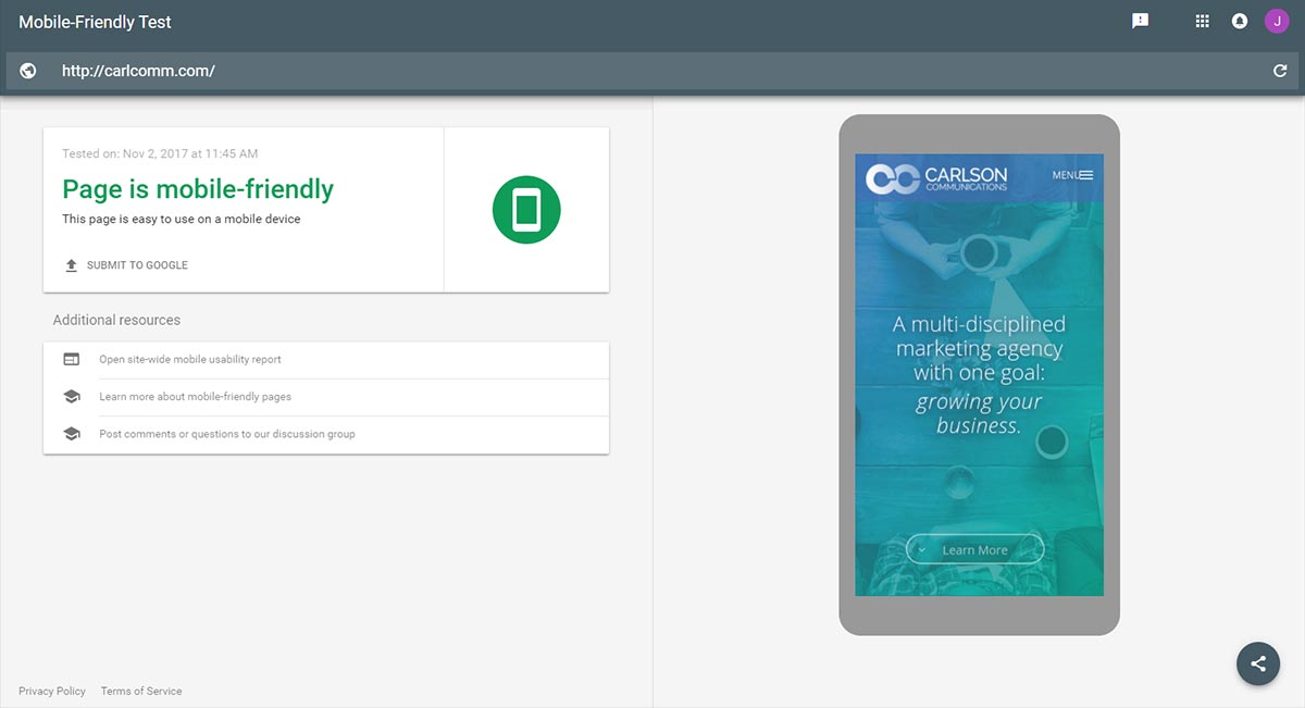 What if your results aren’t as favorable? Well, Google has said not to panic. While the search engine giant is pushing for a more mobile-friendly search experience, they will still crawl and index desktop sites – at least for the time being.
Of course, if you don’t have a mobile site at all, you may want to panic a little bit. After all, it is 2017 and given the fact that 80% of internet users own smartphones, if you’re not catering to their needs, you’re probably losing business as a result.
If you do have a mobile site, the next step will be ensuring that the content and links contained there closely match what’s on your desktop version. This can be challenging without the right design, which brings us to our next point.
Mobile Site vs. Responsive Design
One area where businesses will feel the impact of the switch to mobile-first indexing is in situations where there are discrepancies between the mobile and desktop versions of their site. In most cases, a separate mobile version of a website contains less content than its desktop equivalent.
With mobile-first indexing, content that’s on the desktop version but not on mobile will no longer appear in the search results. That means missed opportunities for many marketers.
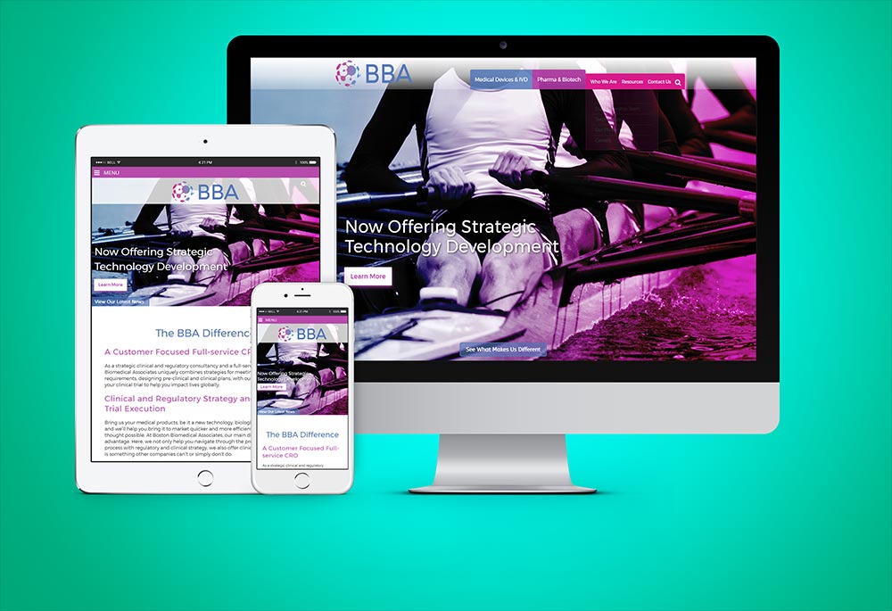
An example of a responsive design website for one of our biomedical clients shown on different sized screens.
Don’t worry, there is a solution. By implementing responsive design as opposed to hosting two separate websites, you can ensure that all the relevant content will always be indexed and displayed in the search engine results regardless of whether the person searching is doing so on a desktop or smartphone.
Responsive design also ensures that the user experience is uniform across any device. This is important, since users are five times more likely to leave a site that isn’t mobile-friendly.
At Carlson Communications, we believe it’s critical for our clients’ website visitors to have an emotionally engaging experience that will prompt them to take the next step based on the clients’ goals.
Whether it’s a biomedical research firm, a professional accounting practice, a residential lifestyle community or a commercial brokerage firm, in every instance we want to ensure the website visitor is engaged and emotionally connected to our clients’ messages. A key part of creating that positive experience is designing a user friendly site that works well on any size device.
How to Prepare for Mobile-First Indexing
While Google hasn’t officially announced the exact date for the mobile-first rollout, most experts guestimate it will likely occur sometime in early 2018. In other words, it’s probably right around the corner, which means businesses should be preparing now to avoid any potential hiccups when the switch is flipped. That said, here are a few tips to keep in mind:
Familiarize yourself with Google’s perspective on mobile-first indexing. A great way to do this is to read through Google’s in-depth blog post on the topic. In the meantime, we’ll narrow down the two most important points:
- If your website features responsive design, the change to mobile-first indexing should have no impact.
- If you have a separate mobile site that is different from your desktop version, the time to make some changes is now.
Get ahead of the game. Yes, switching to a responsive site requires an investment and yes, separate mobile sites are still acceptable to some degree. That’s not to say that Google won’t turn around and make it mandatory that all sites be responsive in order to be indexed in the future. In either case, it’s always better to be a step ahead of the game whenever possible.
Besides, having one site that adapts to all devices is easier for everyone, including your web visitors as well as those maintaining your site.
If you’re not able to go responsive, make sure you update your mobile site. Remember, once Google makes the switch, it will be using your mobile content for indexing. As mentioned, responsive sites will have no issues, but if your websites are separate, it’s imperative that you ensure the most important content is on your mobile version, otherwise you’ll see a negative hit to your rankings.
Utilize tabs and accordion to better organize your content. One positive change that will come as a result of the shift to mobile-first indexing is that Google will no longer penalize sites for having hidden content. That means you can now utilize tabs, accordions and expandable boxes to keep the content on your mobile site more organized and user-friendly.
In Conclusion
With a search volume market share of 63%, it’s easy to see why Google gets to call the shots. The fact that that number jumps to an incredible 95% when it comes to mobile search queries demonstrates why taking the steps necessary to fall in line with Google’s mobile-friendly requirements is absolutely critical for businesses today.
If your site is already responsive, you should be in good shape. If it’s not, however, the impact to your website performance (and your bottom line) could be monumental.
At Carlson Communications, we specialize in helping businesses optimize their sites for mobile so that they both rank well and provide the best possible user experience for visitors.
Like it or not, change is on the horizon. Don’t get left behind! Contact us today to schedule a free consultation.
